Every growth leader I’ve worked with in 10+ years in Marketing Data Science for consumer tech companies like Uber has wanted to feel more empowered to prove the ROI of their work.
To do that, you need to speak the right language allowing you to have deeper conversations, ask better questions, and make better decisions.
Below I’ll break down 10 of the most common analytical concepts to help you do exactly that.
For each concept I’ll share:
A brief explanation
When to use it
An example
I’ve also ordered it from least to most advanced.
Concepts
Distribution
The concept of distribution is extremely important.
It’s the foundation for statistics.
A distribution shows how frequently different values occur in a data set.
Let’s look at the histogram below (which is a classic way to plot distribution).

The X axis is the values of the data in our data set.
The Y axis is how frequently those values occur.
The way the chart looks is known as the shape of the distribution.
The shape provides insights about the nature of the data and is a starter point for most analyses.
When to use it:
All the time.
It’s the best way to understand the pattern of our data.
It helps you identify what the data looks like while spotting any outliers.
Example

On the X axis we plot “Response time (hrs)”.
On the Y axis we plot frequency. This shows for each value of response time, how many times we responded that quickly.
175 times we responded in 2 hours.
70 times we responded in 13 hours.
In isolation, these pieces of information are useful.
But, when you zoom out, you see some very interesting patterns.
We’re mostly responding in < 5 hours 👍
A good chunk of responses are between 10 - 20 hours 👎
The next step would be to dig in and see why responses are taking 10-20 hours.
Common Distributions

When you start plotting distributions, you’ll start to see patterns.
These patterns already have names:
Normal Distribution: Looks symmetrical with most values clustered around a single point.
Many natural phenomena follow this distribution (like human height).
Of all of the distributions, the normal is the one you’ll see the most and it’s so common it’s called normal.
Uniform Distribution: All values show up with similar frequencies.
A good example is birthdays by month.
Birthdays are evenly (or uniformly 😉 hence the name ) distributed across months.
Skewed: Looks like a staircase.
A good example is income where there’s a “tail” representing many outliers. Thanks millionaires and billionaires. Could have just been one of us.
Bimodal: Two peaks.
This suggests two distinct groups within the data which is a great cue that you might have to better segment your data.
Median vs. Mean
First, Mean is just the fancy way of saying average. I’m just going to use average from now on.
Median and Average are 2 different ways to describe what the “middle” of a set of data looks like.
It’s a way to summarize the general ballpark of what you think the data looks like.
It might seem straight forward, but they have very important consequences.
In almost all cases, I recommend calculating Median and Average to get a better understanding of the data.
Median | Average | |
|---|---|---|
Calculation | The middle value when data is ordered from lowest to highest. | The average of all values. |
Let’s look at a random data set:
1 | Median |
2 | 5 |
3 | |
5 | Average |
8 | 7.5 |
13 | |
21 |
Because Median is just based on the order of data it cares less about “outliers”.
I could change the 21 to 21,000 and the Median would not change.
The Average on the other hand is affected by every piece of data.
It’s impacted by extreme outliers (low and high)
When to use it
Use the Median when you have skewed data or outliers that might make the Average look better or worst than it is.
Use the Average when you want to take into account all values equally.
Pro tip: Use them both to get a better sense of the data
Example
We’re making a decision on budgets based on CAC: LTV ratios and you want to know what the LTV of your customers is.

Mode is just the number that occurs the most.
Let’s chart the distribution of LTVs of our customers above.
Most customers have a decent LTV but a few have really high LTVs.
You calculate the Median and Average LTV.
The Average (or Mean) will be higher than a standard customer because it’s being “inflated” by the large numbers.
Instead, use the Median.
You’ll have a more conservative number and a better representation of the normal customer.
If you used Mean you could be spending too much on CACs.
Percentiles
We start by plotting a distribution of your data.
The “Nth percentile” is the value where N% of the data is less than that value.

10th percentile means 10% of the data is less than that value.
Let’s look at some data as an example:
Random Values | Sorted Data |
|---|---|
7 | 0 |
8 | 1 |
10 | 3 |
0 | 4 |
6 | 6 |
15 | 7 |
1 | 8 |
4 | 10 |
3 | 11 |
11 | 15 |
There are 10 data points that have been sorted.
We want to find the 40th percentile.
Where is 40% of the data is less than a value.
With 10 data points, we have 40% of the data less than 6.
This means 6 is the 40th percentile.
Random Values | Sorted Data | Percentile |
|---|---|---|
7 | 0 | |
8 | 1 | 10% |
10 | 3 | 20% |
0 | 4 | 30% |
6 | 6 | 40% |
15 | 7 | 50% |
1 | 8 | 60% |
4 | 10 | 70% |
3 | 11 | 80% |
11 | 15 | 90% |
When to use it
When you want to understand the distribution of your data, identify outliers, or compare individual data points to the rest of the dataset.
Example
At Uber, we would use percentiles to measure user experience.
We would look at ETAs for drivers to pick up riders.
Our average pickup ETA was 3 minutes which sounds great.
But, our 90th percentile was 12 minutes.
This means 10% of the time customers had to wait > 12 minutes to have the driver pick them up.
That’s a really poor UX and it’s something we’d work hard to improve.
Variance and Standard Deviation

We’ve learned about Median & Mean (Average) as a way to understand the general ball park of what’s happening to a distribution.
Variation gives us another piece of information.
Variation quantifies how spread out a set of data is.
Effectively, is the data similar to each other or quite different?
Let’s unpack that with an example.
Data Set 1 | Data Set 2 |
|---|---|
1 | -5 |
1 | -3 |
1 | -1 |
1 | 1 |
1 | 3 |
1 | 5 |
1 | 7 |
If we were to calculate the average for both sets, the average would be 1.
The Variance for both of those will be extremely different.
The Variance for Data Set 1 is 0.
The Variance for Data Set 2 is 18.6.
Ignore what the numbers mean but clearly Data Set 2 has more Variance.
This makes sense. It’s obvious that Data Set 2 is more “spread out”.
The numbers are all over the place.
When to use it
Like much of the concepts here the answer is always. Specifically, when you’re first exploring data or want to better understand it calculate Variance.
It helps you understand how spread out data is and if there are many outliers.
Example
Say you’re looking at daily website traffic. You need to understand how consistent your visitor numbers are and identify unusually high or low traffic days.
Calculate the average and Variance of a prior time period and then you’ll be able to know what the normal Variance is. Anything above or below that Variance will tell you that it might be unusually high or low.
Analyzing the variance in daily website traffic to understand how consistent your visitor numbers are and identify unusually high or low traffic days.
Bonus: Standard Deviation
Standard Deviation is simply the square root of the Variance. It’s a term you’ll hear more often.
For both Variance and Standard Deviation the higher the number the more spread out the data is and you’ll have to be careful of outliers.
Correlation
So far, we’ve been looking at data sets that only have one metric.
We want to learn more about that data set including Median, Average, and Variance.
But, our worlds are never that simple.
We’re usually trying to understand the relationship between 2 metrics.
Spend and signups.
Pricing and conversion
Enter Correlation. A unnecessarily extra word for co-relation.
Correlation measures the strength and direction of the relationship between two metrics.
It ranges from -1 (perfect negative correlation) to 1 (perfect positive correlation), with 0 indicating no correlation.

When to use it
When you want to understand how two metrics relate to each other and more importantly whether changes in one metric are associated with changes in the other.
That last line is key.
You’re looking to see if more (or less) of one metric results in more (or less) of the other metric. A relationship.
Example
You’re a performance marketing manager and want to see the relationship between spend and signups.
You plot spend on the X axis vs signups on the Y axis and see a chart that’s similar to the middle one above.
Uh oh. That’s not good.
The visual suggests that there’s no relationship between spend and signups.
That’s a big red flag and you realize you need to dig a bit more to understand the relationship.
Bonus Example
The situation above is exactly what we found at Uber and it led to a $25M reduction in Ads. Read the full story.
Correlation vs Causation
It’s impossible to be in a growth role without having heard “Correlation doesn’t imply causation.”
But, it’s an important lesson and one that we should often remember.
Correlation refers to a statistical relationship between two metrics where changes in one metric appear associated with changes in the other.
Causation, on the other hand, implies that changes in one metric directly cause changes in the other
Just because a metric appears to be related (correlation) doesn’t mean that they are (causation).
Here’s a great example:

If you plotted the relationship between ice cream sales and sunburn rate by month of year they would appear related.
However, it should be obvious that ice cream didn’t cause the sunburns.
That’s the difference between correlation and causation.
When to use it
Use correlation to identify potential relationships between metrics.
Then, gather additional evidence or run a proper experiment to validate the relationship and prove the causality.
Try to figure out if the relationship is correlation or causation when interpreting data and making business decisions
Confidence Intervals
This is going to be a bit of a doozy.
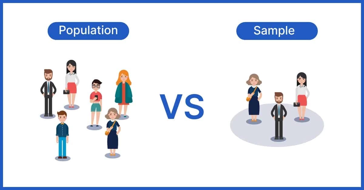
Let me introduce two important statistical terms: sample and population.
The population is the total possible world for whatever data you’re looking at.
The sample is the small subset of the whole population you have access to.
The point of statistics is to use the sample to make guesses about the population.

Let’s say you want to know the average height of all humans.
You have 2 options:
Ask every human on the earth (population)
Ask a bunch of humans and extrapolate (sample)
Guess which one you have to do?
With a sample, you can calculate:
Mean
Median
Variance
Confidence interval
We learned the first 3 terms and now we’ll learn about the last one.
The confidence interval provides a range of values based on our sample that will likely contain the value of the unknown and unmeasurable population.
So our sample’s 95% confidence interval is 5’6 to 5’11.
95% of the time this range of 5’6 to 5’11 will contain the population’s height.
Which means we can “safely” say that the average human height is somewhere between 5’6 and 5’11.
That might seem like a wide range, but think about all the possible human heights. To know it’s likely within a 6 inch range is pretty great.
Statistical Significance
Statistical significance is one of the most significant statistical terms 😉 (see what I did there?).
When you run an experiment, you believe your treatment (new idea) will create a difference than the control (old idea).
Great. Good for you!
But, when you’re analyzing the experiment, you should actually start with the opposite assumption.
You start with the assumption that there IS NO DIFFERENCE.
Then you analyze the experiment to see what happened.

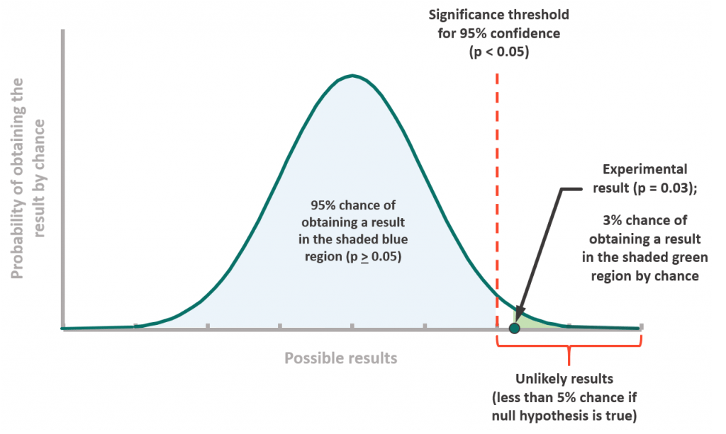
Let’s look at illustration above.
On the right, you can see a tiny dot that says “Experiment result”.
Below, it says “3% chance of obtaining a result in the shaded green region by chance”
The fact that there was only a 3% chance of this happening is really low.
That’s weird.
We say “Hey, wait a minute, let’s go back to that first assumption we made that there is no difference between treatment and control. I don’t think the assumption is right. I have evidence that suggests otherwise”.
And lo and behold you have a statistically significant result.
You’ve proven that your treatment is better than control in a statistically significant way.
Type I/Type II Errors
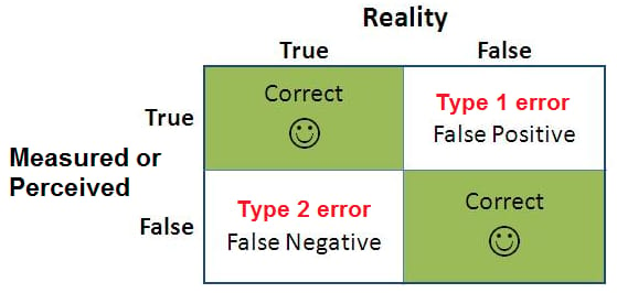
When you experiment, you’re running a test on a sample to decide to roll something out to a population.

Which means there are chances for errors.
Specifically:
Type 1 error: When experiment says treatment is better when it’s worse
Type 2 error: When experiment says treatment is worse when it’s better
Example
In A/B testing, a Type I error would be concluding your new ad design is better when it's not (risking wasted resources), while a Type II error would be failing to detect that your new design is actually better (missing an opportunity).
How you calculate these errors is a bit beyond the scope of this breakdown but its more important that you understand the risks of these errors happening.
A lot of poor decisions have been made because of them.
And that’s it for this week!
Stay experiMENTAL,
Sundar

