The MAUse Trap

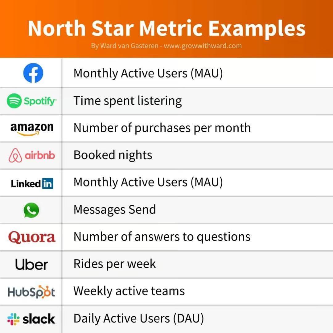
MAU is a very common metric and for social networks it’s often their Northstar metric (read more about Northstars).
The problem is that most don’t know that it’s actually a composition of 4 metrics.
If you don’t break it down, you fall into what I call a MAUse trap.

The biggest reason companies fail is they churn more than they retain.
They need to replace everyone churning causing CACs to skyrocket.
It becomes a death spiral.
By unpacking MAU into 4 metrics, you identify trouble zones and proactively address them.
The 4 metrics
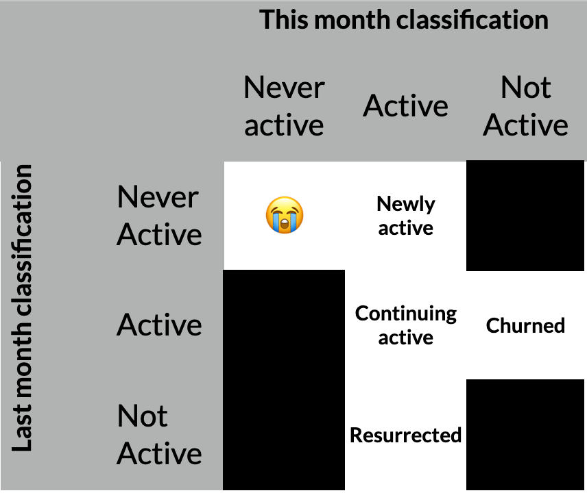
MAU = Newly active + Continuing active + Churned + Resurrected
Also, reminder that an “Active user” can mean many things. It’s up to you to define that.
Newly active
These are all the users that were active for the first time ever in that month.
This doesn’t mean only those that signed up in that month. It can include users who signed up a year ago but just became active that month.
Continuing active
All users that were active last month who continue to be active this month.
Churned
All users that were active last month who are not active this month.
There are many ways to define churn, but for social networks where MAU is most relevant, they have low churn windows. Churn is on the order of days/weeks and not months.
Be careful not to confuse reporting churn which is what we’re doing here with actual definitions of churn using data science.
Resurrected
All users that were not active last month who are active this month.
The same caveat from Churned applies here. Defining them as “churn” last month may not be scientifically accurate. In the next section I’ll share how to use ratios to help you understand what’s going on.
Here’s a helpful little chart:

How to properly track

Most MAU dashboards look like the one above. They’re simple a calculation of how many active users are active in a given month.
At a glance, it’ll always look it’s going up and to the right 📈. It’s a vanity play.
Here’s what you want your MAU chart to look like:

The blue label should say Newly Active not Newly Acquired.
A stacked MAU chart in my opinion is the best way to track.
This also forces a visual that shows the size of the churned cohort which most people forget .
I’d recommend overlaying a normal MAU line to see MAU growth if that’s helpful.
Take it one step further with a series of calculations.
last = last month.
this = this month.
First, we’ll define everyone that was active last month:

This is everyone that was active last month
Then, we look at how many of those continue to be active this month.

Number of people continuing active this month / # of people active last month
The opposite of the Continuing Active Rate is the churn rate. It’s how many people were active last month are not active this month.

We also want to know the resurrection rate. This is the rate at which people come back to be active on our platform that were not active last month but were previously active.

Remember to exclude those who were never active from the Not Active
And finally, we calculate what % of our MAUs are from Newly Active users. It’s fine to be high at the start of your company but over time you want a stable base of continuing users. Otherwise, it signals a reliance on new acquisition.

With these 4 ratios, you can identify patterns and have a quick but strong understanding of why your MAU has gone up or down for the month.
Recap
That’s it for this week, friends! Some key takeaways:
MAU is a great Northstar metric but don’t fall into a MAUse trap
Break down MAU into 4 sub metrics to have better visibility
Calculate 4 key ratios so you can quickly diagnose issues
👍️ Loved it? 👎️ Hated it? Let me know!
One last ask: If you’ve found this newsletter useful, I’d love for you to tell just 1 friend or colleague about it. Referrals are a great way to share the love and help me grow!

